Product · UX
Sales Commission Hub
An in-house app that turns a clinical lab's month-end commission spreadsheets into reviewed, encrypted reports for every sales rep, prototyped and pitched to the C-suite.
- Role
- Product design · UX · prototyping · pitch
- Timeline
- 2022
- Tools
- Figma, interactive HTML prototype
The ask
At a clinical lab, the CTO I reported to asked me to prototype an in-house tool for one of finance’s most painful monthly jobs: commission reporting. I designed it, built the prototype and pitched it to the CFO, CEO and the rest of the C-suite. The company name and brand are left off here; the problem is the point.
The problem
Every month, finance pulled four exports (sales, payments, which rep owns which account, and a log of changes), stitched them together by hand and emailed each rep a report. The hard part wasn’t the math. It was the exceptions: reps on leave, reps who left, new hires and accounts moving between people. Those are exactly the cases where a manual process breaks, and where a wrong number costs trust.
Research
The first brief was one-sided: a tool for whoever ran month-end. Research changed that. I sat with the sales team and interviewed reps and the sales manager, the people whose numbers were being calculated and the person keeping the overview. That surfaced a second set of needs the original brief hadn’t accounted for.
So I scoped V1 to the sales admin, with review before anything goes out and encrypted reports to each rep, and planned V2 as a fuller portal for the manager and reps. For a money workflow, getting the review step right mattered more than self-service. The sales manager also wanted to see each report as a document before it went out, so I worked with the CTO to add a review step. I met with engineering during design, not after, so the scope matched what could actually be built.
How it changed
My wireframes and Figma screens from 2022. The prototype further down is an interactive rebuild of the Figma version.
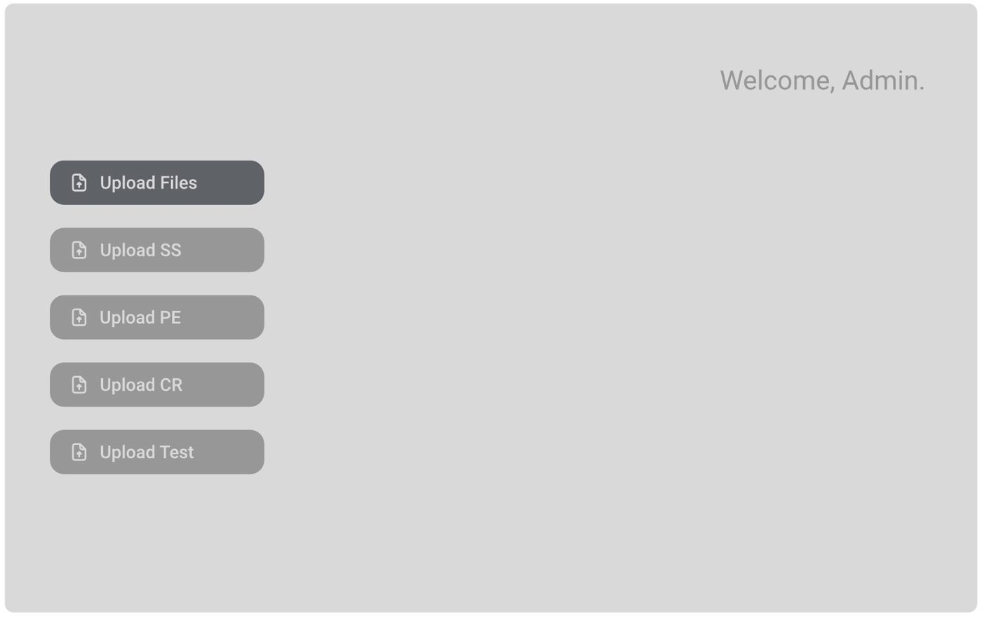 wireframe
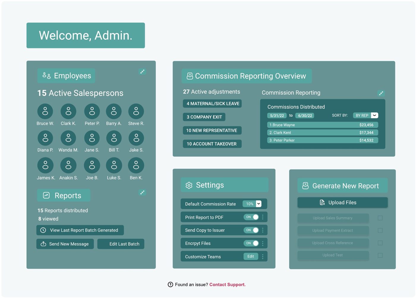 figma
figma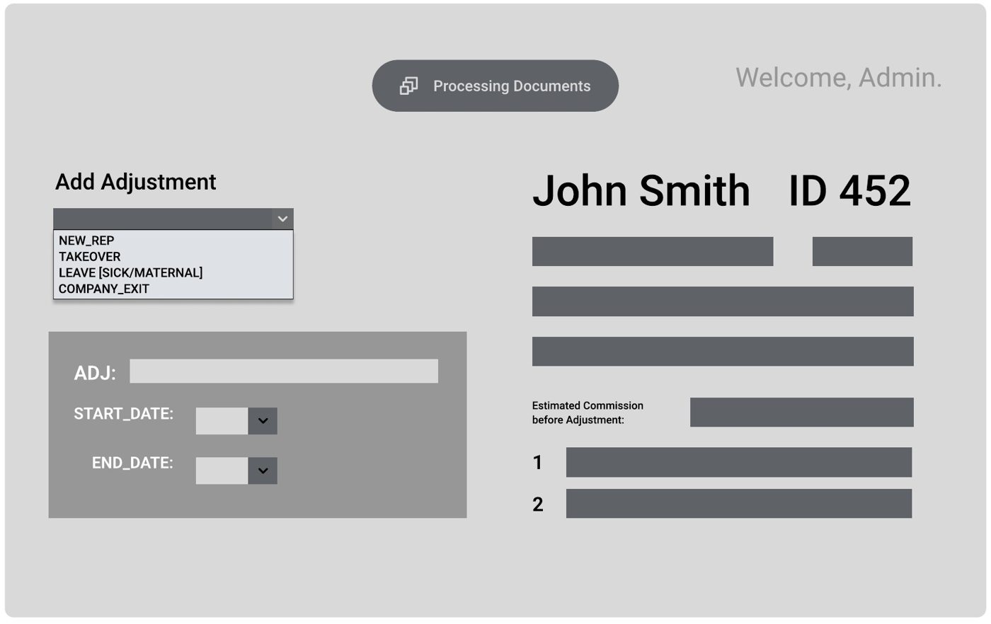 wireframe
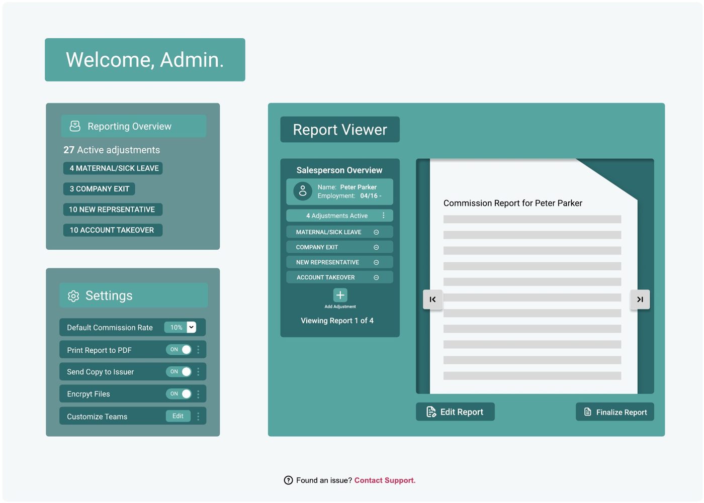 figma
figma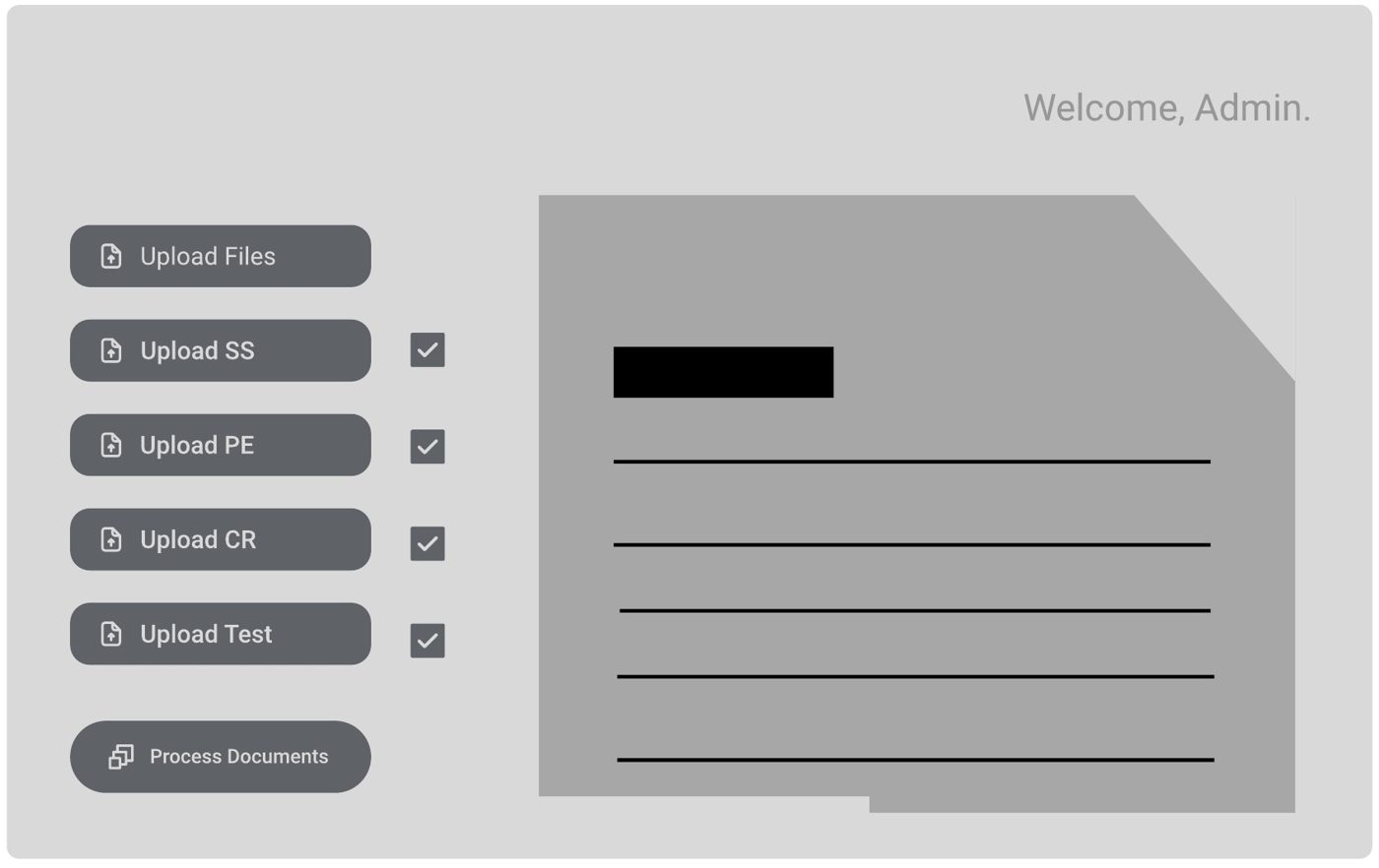 wireframe
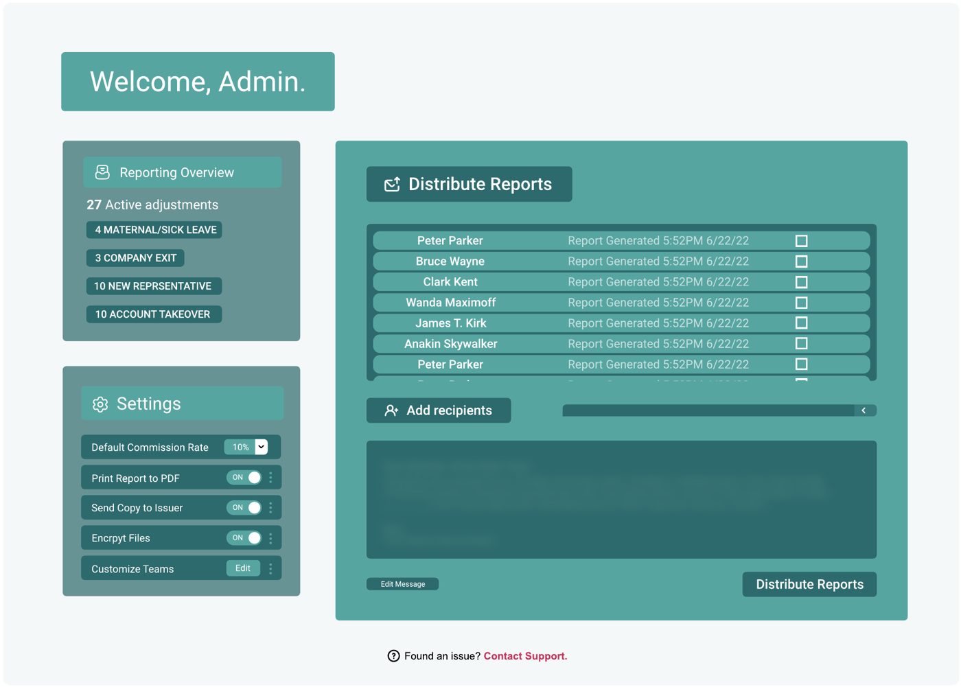 figma
figmaThe start of a design system
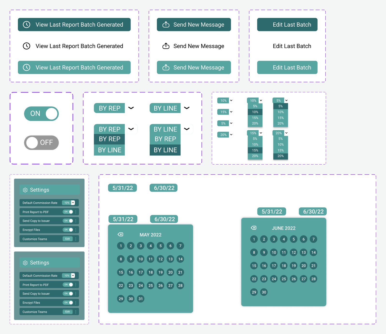
I built the app’s pieces in Figma as reusable components with their states: filled, text and light buttons, on/off toggles, sort and rate dropdowns, a date-range picker and the settings panel. The CTO approved them as the starting point for the company’s design system and gave me sole responsibility for it. The company downsized before I could take it further.
The flow
- Sign inV1 is built for the sales admin. SSO in production.
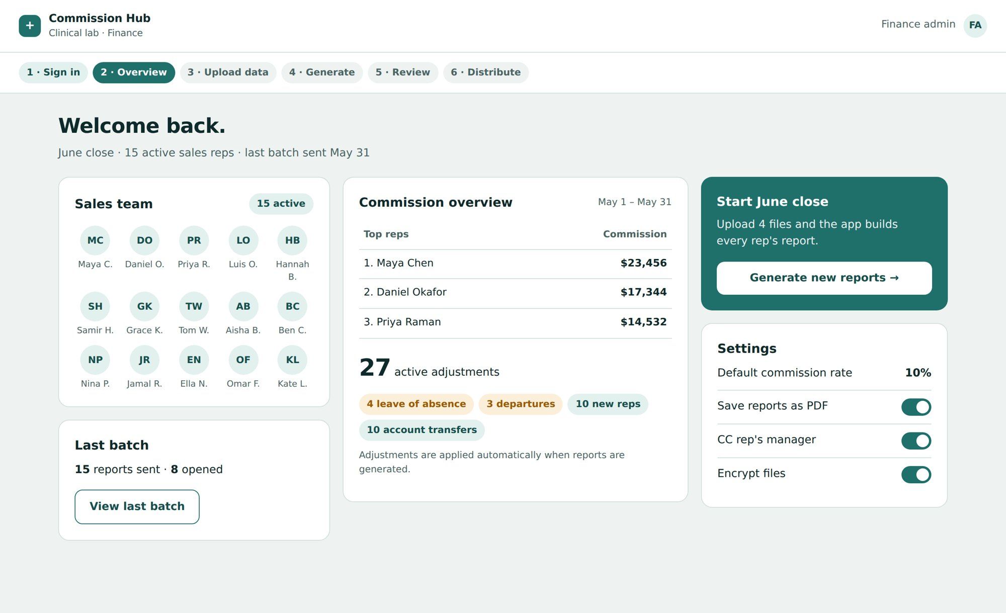
- OverviewWho's active, last month's totals, and every open adjustment, before anything runs.
- UploadA four-file checklist. Generate stays locked until every file is in.
- GenerateMatches payments to reps and applies adjustments automatically.
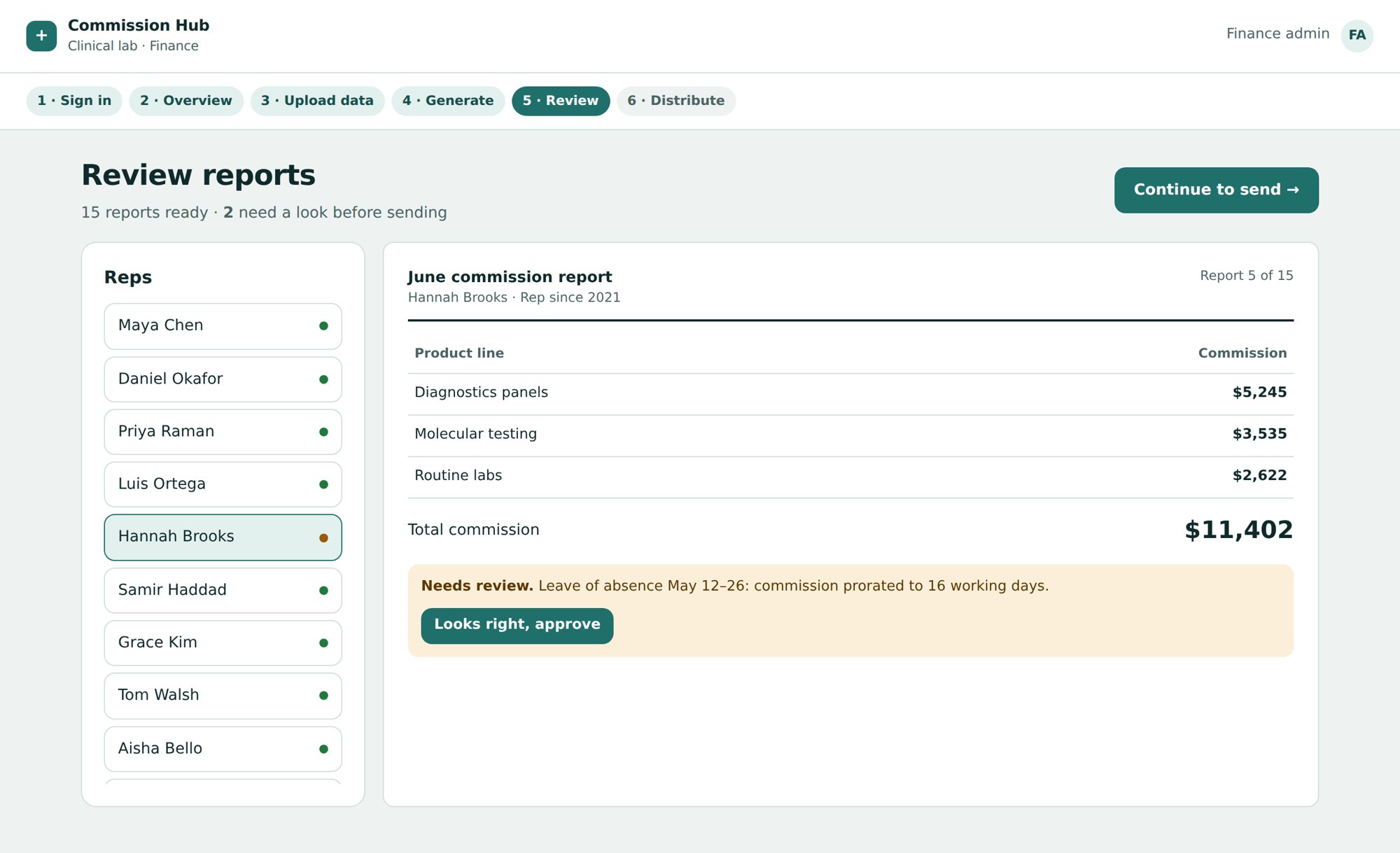
- ReviewOnly the reports with exceptions are flagged, with the reason in plain words.
- DistributePick recipients, edit the message, send encrypted PDFs.
Try the prototype
Open full screen ↗ · Sample data, no real names or figures.
Design decisions
Exceptions first. Adjustments sit on the overview and come back as flags at review, so the 2 reports that need a human aren’t buried among the 13 that don’t.
A checklist instead of a drop zone. Naming each file and where it comes from removes the “did I upload the right export?” question, and it blocks bad runs before they start.
Review before send. Nothing goes out until someone has looked at the flagged reports. For money, a confirmation step is worth one extra click.
Settings stay visible. The commission rate, PDF, manager CC and encryption are visible on the home screen, because finance needs to see them, not hunt for them.
Outcome
The CFO loved it, and the app was approved and scheduled to be built, with the manager and rep portal lined up as V2. Then the company downsized before development started, so it never shipped. With more time I’d test the review screen with the people who actually run month-end and add an audit log, so finance can show exactly what changed and why.